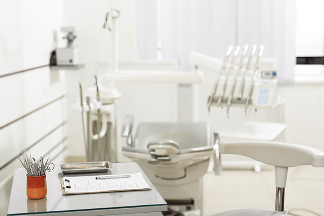
Choosing Between Modern and Retro Looks for Your Dental Office
Posted by HJT Design
 If you’re concerned about every aspect of building a successful dental practice, you know that there are many components that go into it. One of the elements of building a successful dental office that often goes overlooked is the overall design of the office. Believe it or not, your design decisions for the office can actually make a significant impact on your business.
If you think about it, it actually makes a lot of sense. Many people hold onto life-long fears of having to visit the dentist. However, if you carefully select your design features to make your dental office a soothing and comfortable one, your patients will stop dreading their visits to your office.
When it comes to current design trends, there seems to be a battle occurring between modern and retro looks. If you are considering incorporating one or both of these design styles into your dental office, but can’t decide which one is best, consider the following benefits of each.
Benefits of Modern Design
- typically has a luxurious or high-end aesthetic
- punctuated with clean lines and simple features
- easy to accomplish with minimal effort
Benefits of Retro Design
- traditional and comfortable
- familiar and reminds many people of simpler and happier times
- very inexpensive to accomplish
How to Use Both Modern and Retro Design in your Dental Office
Since both retro and modern design styles offer their own unique set of benefits, why not combine elements of both in your dental office to accomplish the best of both? It can be a little tricky to successfully combine these two styles because they are the opposite of one another, but when done correctly, it can look and feel amazing. Here is how to take combine the best of classic and contemporary in your dental office to set your patients minds at ease, while also making your team feel productive during the work day.
Design Tips for Combining Retro and Modern Styles
- Modern furniture tends to be uncomfortable despite its aesthetics.
- Walls, ceilings and floors are the best place to incorporate modern influences.
- Stark white glass tile throughout for an ultra-high end look.
- Soften things up with bricks. Brick accent walls make a great cozy addition.
- Combine the clean lines of modern design with the warm and fuzzy feelings of retro materials for a nice contrast. Soft woods are a great way to accomplish this.
- Mix and match the furniture against a simple backdrop on the walls.
- Pair traditional furnishings with modern accents and artwork
Another fun and bold design tip for dental offices is to incorporate the power of color through lighting and colors. Studies show that colors can have a powerful impact on a person’s mood. For example blue rooms are said to be calming and help to lower a person’s blood pressure, heart rate, and respiration rate, making it a great option if you want to calm nervous patients. Consider trying different colors in different treatment rooms to customize your patient’s experience.
Remember that the design of your dental office will be the backdrop for your dental practice. In a sense, it is the foundation for the daily on-goings of your business. It can impact your mood, productivity, and revenue. Combine the best parts of modern and retro styles to create the best possible environment for your dental office. Contact HJT to schedule a free consultation for answers and knowledge to prepare and empower you in moving forward with confidence.